In today’s digital world, having a visually appealing and functional website across multiple devices is essential. With the rise of mobile devices, it’s crucial to have a responsive website that adapts to different screen sizes. This is where responsive design comes in.
Responsive design is a web development technique that allows a website to adjust to different screen sizes and resolutions, providing an optimal viewing experience for users.
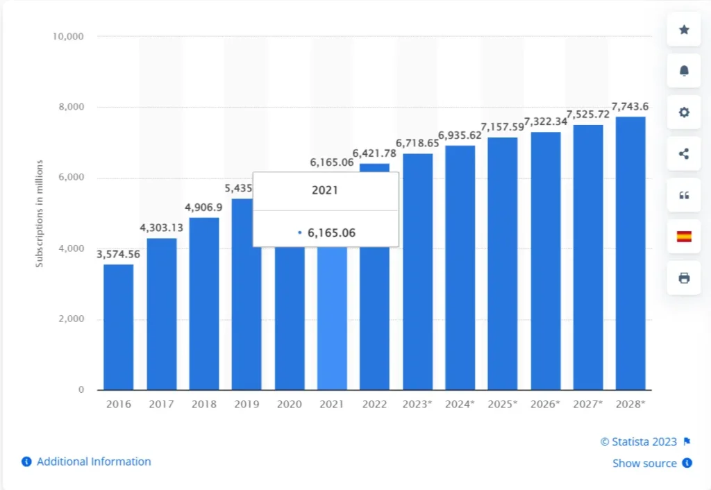
According to a research data by statista, the roughly size of smartphone users are 6.9 Billion.
Google also consider mobile-first site as user/audience love to find information on mobile.
In this article I will explore the power of responsive design and how it can boost your WordPress website.
Benefits of Responsive Design
1. Improved User Experience
One of the primary benefits of responsive design is that it improves the user experience. When a website is responsive, it automatically adjusts to the device’s screen size, making it easy to navigate and read. This means users can easily access your content, regardless of their device.
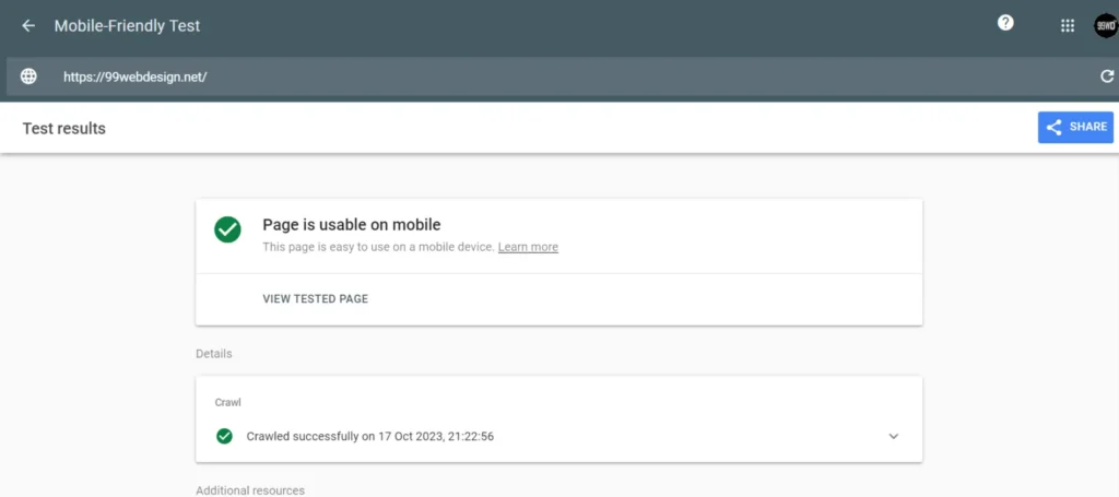
You can try Google mobile friendly test tool to ensure whether your website is responsive or not.
2. Increased Mobile Traffic
With the increasing use of mobile devices, having a responsive website is more important than ever. Mobile devices now account for more than half of all internet traffic.
By having a responsive website, you can attract more mobile users, which leads to more conversions.
3. Better SEO
Another benefit of responsive design is that it can improve your search engine rankings.
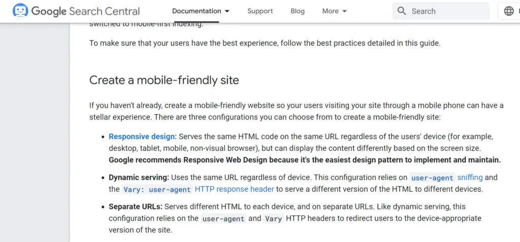
Google is now using mobile-first indexing, which means it first looks at your website’s mobile version when determining its ranking.
You may miss valuable traffic and rankings if your website is not responsive.
How to Implement Responsive Design on Your WordPress Website
Now that you understand the benefits of responsive design let’s look at how you can implement it on your WordPress website.
1. Choose a Responsive Theme
The first step is to choose a responsive theme for your website. There are many free and premium themes available that are optimized for mobile devices.
When selecting an article, check that it is responsive and works well across different devices.
Some of the recommended SEO-friendly and responsive themes are;
2. Use a Responsive Framework
Another option is to use a responsive framework, such as Bootstrap or Foundation, to build your website. These frameworks provide tools and templates that make it easy to create a responsive website.
3. Optimize Images
Images are an essential part of any website, but they can also slow down your site if they need to be optimized. Optimize your images for the web so they load quickly on all devices.
There are some popular image optimization plugin available like ShortPixel and Imagify. These two plugins are very powerful and comes with seamless features for your WordPress images.
You can easily convert images from PNG/JPEG to WebP or AVIF.
Checkout some essential features of Shortpixel plugin
- Image Compression: Efficiently compresses images to reduce file size without compromising quality.
- Bulk Optimization: Allows bulk optimization of existing images in the media library.
- Automatic Optimization: Automatically optimizes new images upon upload.
- Various Compression Levels: Offers different levels of compression to choose from based on needs.
- WebP Support: Supports the generation and delivery of WebP images.
- PDF Compression: Capable of compressing PDF documents.
- Thumbnail Optimization: Optimizes thumbnails generated by WordPress.
- Cloud Optimization: Optimization process occurs on ShortPixel’s cloud servers, saving server resources.
- Compatible with Various Image Types: Supports JPEG, PNG, GIF, and WebP image formats.
- API Access: Provides API access for integrating with other applications and services.
- Backup Originals: Option to backup original images before optimization.
- CDN Support: Compatibility with various CDN services for faster content delivery.
4. Test Your Website
Once your website is responsive, it must be tested to ensure it works well across different devices.
You can use tools like Google’s Mobile-Friendly Test to check how your website looks and performs on mobile devices.
Conclusion
Responsive design is a powerful tool that can boost your WordPress website. By improving the user experience, increasing mobile traffic, and improving your SEO, responsive design can help you attract more visitors and grow your business. Follow the tips outlined in this article to implement responsive design on your website and start reaping the benefits today.