As a web developer you should always consider SEO-focused website designing. Practicing best strategies of SEO can boost traffic, increase leads and sales.
SEO practice is one of the marketing strategies for business owners.
As technological adaptations continuously evolve, so do the strategies employed in SEO (Search Engine Optimization) and web design.
Google’s shift towards mobile-first indexing accentuates the urgency of prioritizing mobile-friendly web design to maintain a robust online presence.
This article seeks to unravel the synergy between mobile-first design and SEO, outlining best practices to harness the benefits of this integrated approach.
Understanding Mobile-First Design
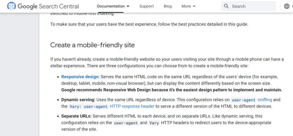
Mobile-first design is a web design philosophy that involves creating a website based on the smallest screen size.
The inception of this design strategy stems from the substantial increase in mobile internet usage, making it essential for websites to be optimized for mobile devices to cater to the broader audience.
Melding SEO with Mobile-First Design
Integrating SEO strategies with mobile-first design is a critical synergy for achieving search engine success.
A well-optimized mobile website augments;
- User experience
- Loading speed
- and accessibility.
Best Practices for Uniting Mobile-First Design and SEO
Responsive Design: Opt for a responsive design that ensures your website’s layout adjusts seamlessly across various devices and screen sizes. Responsive design enhances the mobile user experience and is a preference of search engines.
Page Load Speed: Enhance page load speed by optimizing images, leveraging browser caching, and minimizing code. Fast-loading pages reduce bounce rates. Search engine like Google love fast loading website because it impact the ranking in SERP.
Learn how to improve your website performance
Simplified Navigation: Ensure that navigational elements are designed to be touch-friendly. Simplified navigation enhances usability, encouraging users to explore the website more.
Optimized Content: Craft succinct and easily scannable content on mobile devices. Utilize headers, bulleted lists, and short paragraphs to improve readability, ensuring users can quickly find the information they seek.
Touch-Friendly Design: Ensure that interactive elements like buttons and links are adequately spaced and easily tapable to enhance the mobile user experience.
Local SEO: Optimize for local searches by listing your website on Google My Business and other local directories. Mobile users often conduct local searches, making this a crucial aspect of mobile SEO.
Avoid Flash and Pop-ups: Evade using Flash and minimize the use of pop-ups as they tend to be cumbersome on mobile devices, deteriorating the user experience.
Structured Data: Implement structured data to enhance your website’s visibility in search engine results through rich snippets, which can substantially improve click-through rates.
Test and Improve: Regularly test your website’s mobile performance using tools like Google’s Mobile-Friendly Test. Continuous testing and improvement are essential for maintaining optimal performance.
Conclusion: Crafting a Conducive Mobile SEO Strategy
Embracing mobile-first design and SEO best practices is not merely a trend but a fundamental requirement for websites to flourish in the contemporary digital landscape.
The intertwining of these practices is a testament to the significance of mobile optimization in elevating a website’s overall success in search engine rankings and user engagement.
By adopting these best practices, businesses can craft a comprehensive mobile SEO strategy that fosters enhanced visibility, usability, and conversion rates, driving the triumph of their online endeavors.
Subscribe to our newsletter!